The folly of it all. And the pain

Compare and contrast. But does Paula Rego match up to Goya. Does she have to?

Read more:


Dead men hang from tree stumps watched impassively by a lounging soldier; a child weeps as her stricken mother is carried away from the tumult of war; a grieving wife holds the dying husband she cannot bear to let go; a soldier seizes a woman unaware that he is about to be stabbed in the back by a vengeful mother.


Scenes of violence and despair, abject sorrow and pain. These are the images by the Spanish genius Francisco de Goya which the artist Paula Rego hung above her bed. They must have permeated her dreams and certainly influenced her work.


Goya created the etchings towards the end of his life (1746–1828) when he was overwhelmed with despair  - and anger - at the political repression and the horrors of conflict which gripped Spain in the early 19th century.


An unusual exhibition at the Holburne Museum in Bath attempts to connect the inspiration Rego drew from the Spaniard’s works in Uncanny Visions: Paula Rego and Francisco de Goya (until January 5) by setting Rego’s series of more than 30 etchings of Nursery Rhymes alongside Goya’s Los disparates (The Follies).


One can certainly agree both artists produced ‘uncanny’ works though the word does not quite do justice to either. Not to the devastating, visual diatribes of Goya nor to Rego’s satirical, fiercely feminist, anti-establishment fantasy world.


Goya drew The Follies between 1815 and 1823, but they were so controversial that they were not published until 1864, sixty years after he sought exile from the convulsions of his home country in Bordeaux, France.


Rego, who died in 2022 aged 87, began work on Nursery Rhymes in 1989, the year after her husband died, partly to entertain her two-year-old granddaughter Carmen who would have been happily unaware of their undercurrents of incest, vanity, violence and even cruelty to children.


She would have been too little to make anything of the boy being beaten in The Old Woman who Lived in a Shoe, unaware of the oddly sinister girl smirking while soldiers gather around the shattered remains of Humpty Dumpty. The dancers in Ring-a- Ring -a’ Roses give no clue that the roses signalled the onset of the bubonic plague and the finale, ‘We all fall down' means death.


In Polly Put the Kettle On Rego portrays herself as Polly serving tea with another woman to soldiers half their size. How could Carmen have known that the soldiers are made of chocolate - and they are, in fact, the tea time treat for Polly and pal?


It’s easy to overlook the horrors in some of these familiar lines. Rego made two images of A Frog He Would A-Wooing Go. One has a splendidly pompous Frog with two ratty chums which would add charm to any children’s book, the other a brutal depiction of three killings which clashes horribly with the rollicking chorus.


But then, as WH Auden said: ‘There are no good books which are only for children.’


Throughout, the influence of illustrators such as John Tenniel, Beatrix Potter, Arthur Rackham, even William  Hogarth, is evident but it is with Goya that we are invited to compare Rego’s rhymes and that’s where things get problematic.


Take Three Blind Mice, grotesque creatures more like rats, razor sharp teeth, dead white eyes, attack a woman but she fights back, knives flailing. Alongside is the huge grinning figure of Goya’s The Simpleton. It’s carnival time, he’s playing the castanets and it should be fun, but while he dances two ghostly heads emerge from the shadows. Are they screaming? Shouting? A frightened man hides behind a helpless female figure. That grin is more a demonic grimace.


One of Rego’s more unsettling works is Baa Baa Black Sheep, in which a child seems to be pressing up against the animal - Rego made it a ram  - in an embrace. The darkness of the piece is exaggerated because of a mistake in printing which made the etching blacker than planned but, however disturbing it is, Goya’s Unbridled Folly or The Horse Abductor, hung alongside which is altogether more compelling. A horse rears up against a doom laden sky, it is all muscles and wild eyes, a symbol of lust, intent of carrying off a woman, something she seems to quite relish. In the background huge, terrifying rats skulk around, one of which is eating a woman.


Rego represents Lady bird, Ladybird, a poem which might be about the persecution of Catholics in England, with the ladybird fluttering overhead symbolising the Virgin Mary, by staging a stately gavotte danced by elegant ladies and strangely decorous but alarming insects. In Goya’s Exhortations a wild-eyed woman, clearly terrified, is pulled around by flurry of figures, one has three arms, some have two heads, another stands, finger raised in admonition. The curator’s note suggests that the scene is a ‘metaphor for the choice between vice and virtue, lust and chastity’ but the overriding effect is of tumult and terror.

Perhaps it is unfair to compare the two - something that’s hard to avoid given the way the exhibition is organised. Rego was to an extent circumscribed by the theme she chose, though obviously attracted by the subversive undertones of the rhymes.

Goya’s view of the world was sweeping, apocalyptic. In the 22 etchings of The Follies he drew on the deep, sombre corners of his imagination to produce a scathing and haunting denunciation of his homeland.

What to make of the show? It’s a treat to see such rarely shown works and to that extent it’s a an intriguing diversion but putting like with unlike blurs the appreciation of one or the other and suggests that we have to decide between the two?


Of course, both play heavily on the surreal but should we prefer what Auden described as 'A magical convergence: the absurdity of English nonsense illustrated by Rego’s marvellously dark fantastical drawings... Anyone will thrill to these?’


Little Miss Muffet fits that billing. Rego made three versions of the arachnophobic psychodrama, two of which find Miss M distinctly disturbed by the creature but in one she gives the spider quite a kicking. It’s a splendid scene, one of the few in colour, and given a particular piquancy when you realise the creature has her mother’s face. A disturbing aside, and one that acknowledges Rego’s difficult relationship with her mother. Nonetheless, it’s more fun than fearful.


Poor Folly is deemed to be similar to Little Miss Muffet, sharing ‘a sense of impending doom’ which hangs over like Miss Muffet’ with its terrified woman running into a building, a church perhaps. Why does she have two heads? Is she looking to the past and to the future? Are the men behind her a threat? Why is one of them screaming? A gaggle of old women, grim and ghostly lurk, are they urging her on or driving her to a terrible fate?


It could also be an allegory for Spain itself, fleeing from the terrible past of the Peninsular Wars in which more than 200,000 perished but uncertain as to what the future might bring. There really is no comparison to Miss M.


This is a world without pity and little hope. Perhaps Aldous Huxley writing in 1962 captured Goya’s virtuosity as well as any; the way he created the ‘most powerful of commentaries on human crime and madness... uniquely fitted to express that extraordinary mingling of hatred and compassion, despair and sardonic humour, realism and fantasy.’
Beyond the curve

Many artists reprise the same style, similar techniques all their careers. Not Antonio Calderara.

Read more: https://www.theneweuropean.co.uk/antonio-calderara-the-changing-man/


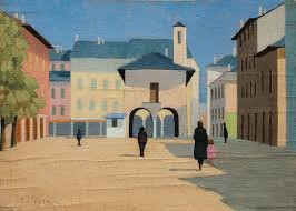
For most of his life Antonio Calderara sought inspiration from the misty shores of Lake Orta, the smallest of Italy’s northern lakes, where houses rise like terracotta ziggurats from the water’s edge, streets are cobbled and narrow, church towers rise above town squares.


It’s tempting at first glance to dismiss the painting as charming, pretty, but that would underestimate their subtle draughtsmanship, the way the planes of shade and light combine to create a sense of mystery, almost one of foreboding.


It was a style which won him years of steady success, but by the time he reached his fifties he announced: ‘In 1958...I drew my last curved line.’


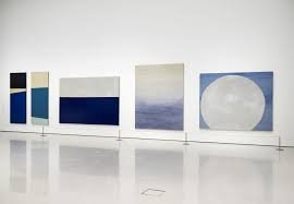
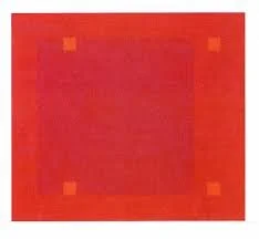
And that was that. No more carefully crafted scenes of squares and quiet streets, instead, horizontal lines, vertical lines, enigmatic square and rectangular shapes often in pastel and invariably set against one dominant colour.


Not so fast. The change was by no means as clear cut as his laconic statement might suggest as an exhibition at the Estorick Gallery, the north London gallery dedicated to 20th century Italian art, demonstrates in Antonio Calderara; A Certain Light (until December 22).


Calderara was born in 1903 in Abbiattegrasso, south west of Milan, before moving to Vacciago on the shore of the lake with his wife Carmela and daughter Gabriella, where he lived for the rest of his life.


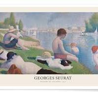
He was self taught, abandoning his studies as an engineer in 1925, and was mentored in his early years by Lucio Fontana, who was a family acquaintance, though none of his work reflects the slashed canvases that Fontana made his own, instead some of the early paintings are more reminiscent of Giorgio Morandi, particularly Natura Morta, and Georges Seurat in atmosphere, if not technique.


He was never really famous, he remained a loner whose work was considered by some to be a tad provincial. He did not run with the artistic pack who gathered in Milan and were gripped by the febrile world of Italian art in the post World War One years. Some rejected the violent imagery of Futurism, others embraced the traditionalist styles of the Novocento or gave short shrift to Pittura metafisica (Metaphysical Art), a movement created by Giorgio de Chirico and Carlo Carra.


Rather, Calderara said he owed his greatest influence to the simplicity and subtle light exemplified  by the 15th-century Italian painter Piero della Francesca, something that is evident in the earlier works, geometric but with their hard edges softened with pastels of grey, ochre and faded reds.


Take The Market Square in Orta (1929) in which the heat of the day positively bounces off the walls of the buildings, spreading a deep shadow into the square. Black clad figures, a girl in pink, their backs to the viewer, are curiously immobile, keeping their distance - and their secrets. Despite their presence there is strange emptiness about the square.


And again, in a scene across the lake (untitled) to the island of San Giulio which is framed by grey blue mountains, the bulk of the church and campanile are carefully drafted but in the foreground a group of villagers, stand, all with backs to the easel, creating a similar atmosphere of disconnect and mystery.


There are signs of (abstract) things to come with The Factory painted as early as 1932 in which the low lying bulk of the building and the slivers of two smoking chimneys almost disappear into misty nothingness.


By the late Fifties he was finding inspiration in the radical theories causing a stir in the USA by such as Jasper Johns and Robert Rauschenberg and Josef Albers. No doubt he was influenced by Ad Reinhardt, in what might be the rallying call for all abstract artists, who declared in 1962: “The one object of fifty years of abstract art is to present art-as-art and as nothing else…making it…more absolute and more exclusive—non-objective, non-representational, non-figurative, non-imagist, non-expressionist, non-subjective.”


Calderara was particularly impressed by the way Agnes Martin created her grids of horizontal and vertical lines to evoke a world of emotions and possibilities but the most significant influence was Piet Mondrian whose minimalist technique of straight lines and primary colours he first came across in 1954 when aged 51 and whose work inspired his dramatic rejection of the curved line.


To emphasise his progress from figurative to abstract, the curators have hung a winter scene (untitled) from 1951 alongside Painting - Winter (Snow in Vacciago) (1957–58). In the earlier scene the snowy hillside, the dark of the trees, merge with the ice covered lake and the hills beyond. There is something of the abstract about it - it is certainly impressionistic - while in the later version the imagery is reduced to minimalist squares and rectangles of muted blue, grey and brown.


Other paintings are poised on the cusp of abstraction such as Contemplation, (1958) in which a figure, almost christ-like, wreathed in the dull orange of a deep fog, holds what looks like a shovel. In The Bell Tower (1959) the narrow campanile is almost lost in the lines and rectangles and the  nuanced pastel shades of the composition. It is framed by walls - a familiar technique of Calderara’s to enhance perspective - and one echoed in many of his abstract works including what was perhaps the first of his unequivocally abstract works Vertical Counterpoint in Red, (1959) in which the merest blush of pink is balanced by two narrow stripes of grey.


A series of untitled paintings using only horizontal bars of colour conjure up his new vision of familiar scenes, the mist and moods of the lake, but the imagery becomes more complex. One Untitled (1960)) has a frame within a frame, the backgrounds are soft, off white, there is one  rectangle of pink against grey, alongside another of the lightest grey barely contrasting with the lightest of pinks. In Attraction of Square into Yellow (1967), the greeny-yellow of the canvas is broken only by a tiny green square on the right side.


Some of these, often enigmatic, images invite the viewer in. Some coax, all challenge. Space Light (1961–62) is a deep, deep red. It demands you peer into its depths, where, what seems to be a solid mass of colour, almost conceals oblongs of reds in different, intense shades.


It is impossible not to be drawn in by Parallel Encounter in a Unit of Light (1960), its powerful black broken by two sets of grey in different strengths which perhaps reflects the intimations of death he must have felt after suffering heart attacks and the grief he still felt at the death of his daughter in 1944. So strong was his pain at her death, he ‘updated’ the portrait which hangs in the exhibition several times long after she had gone.


These paintings fulfil Calderara’s desire ‘to paint the void that contains completeness, silence and light. I would like to paint the infinite’ and none does that with greater intensity than Constellation painted in 1969. Pitch black with tiny grey and even blacker squares there is something Rothko-esque about energy it radiates with its luminosity and emotional pull.


As he wrote to a critic friend: ‘Structure and reason should never overshadow the emotion that I like to define as ‘poetry.’’

Give the man a break!

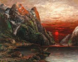
One of Norway’s grandest painters, Adelsteen Norman deserves better as the European Capital of Culture unwittingly shows.

Read more:

Behind the mask

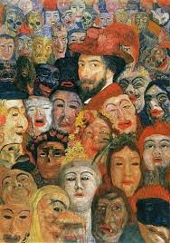
James Ensor, a mass of contradictions, painter of the grotesque, painter of roses. What was he really like. It was fascinating to find out on a journey through his homeland of Flanders. Be intrigued; read more:https://www.theneweuropean.co.uk/the-ego-has-landed/

When a photograph isn't....

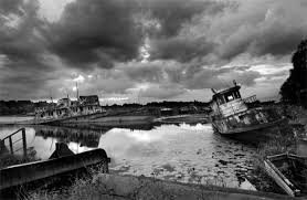
Photo London had the usual array of flash and trash - and remarkable talent. Many continuing to redefine what photograph actual is - as this selection of Turkish image-makers illustrates.

Read more:

Cherchez les femmes

Bit of a mish mash at Margate Contemporary. Poor signage, tricky catalogue. Why make life so difficult? Still, there were some highlights

Read more:

The Merz ‘alien’

When winning is losing

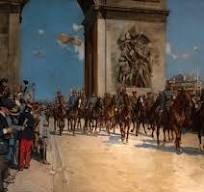
Exhibition at the Army Museum in Paris gets us in the mood for the agony and ecstasy of the Olympic Games which the city is staging this year.


Victory parade under the Arc de Triumph at end of World War One

Fake views

Brilliant small show at the Courtauld (that brilliant small gallery) about the arts and craftiness of the fakes and forgers over the centuries.

Read more:

When the fighting has moved on...

There are many brave, inventive, photographers of war. But few capture the pathos, the suffering and the quiet dignity of the victims as well as Ivor Prickett.

Read more: https://www.theneweuropean.co.uk/no-home-from-war-images-of-conflict-survival-and-loss/

Two above: Syrian refugees.

Below the grieving woman in Mosul